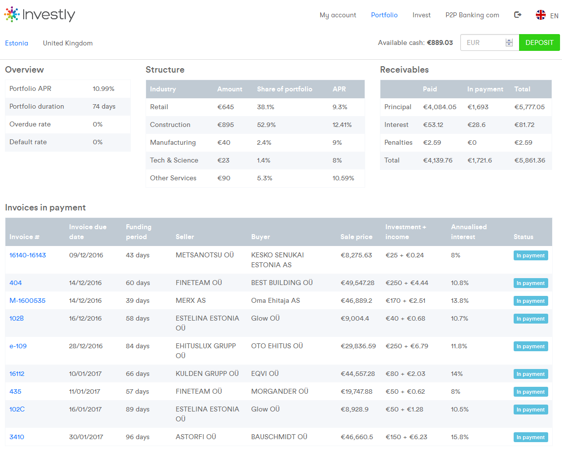
Invoice discounting marketplace Investly released a new version of the website today offering a redesigned investor interface. Investly allows investors to finance invoices sold by British and Estonian SMEs. Since the launch 11 months ago the number and volume of invoices financed has steadily increased. On the other hand rising investor demand pushed down the interest rates during the auctions to the minimum rate of 8% often during the past weeks.

New Investly dashboard. View of my portfolio page. Click to enlarge
At the moment I don’t have any overdue payments – however in the past some payments were delayed for a few days. None of the invoices financed on Investly have defaulted so far.
Overall the new interface is a nice improvement and offers a better overview than the old layout. But there is still room for improvement. I would have liked it, if the tables were sortable for example. Also in the following view, despite the tooltip I didn’t immediately grasp that the green and light blue bars each represent an invoice in the payment history of this seller-buyer relationship.
What is your opinion on the new Investly dashboard dear reader?


It is still not working properly for me.